
In Praise of “Useless” Features: The Business Case for Pure Delight

There’s a dangerous idea creeping through product rooms and roadmaps: if a small feature can’t prove its ROI next sprint, it doesn’t deserve to ship. It’s tidy. It’s measurable. And it’s wrong.
The best products aren’t just efficient-they’re loved. That love is rarely the result of a single “killer feature.” It’s the accumulation of little choices that make people smile at just the right moments: a playful loading message, a celebratory animation, a whimsical button that bypasses monetization entirely. As Charles Eames put it, “The details are not the details. They make the product.” (Herman Miller)
Below is the case for deliberately building pure delight - the small, “useless” flourishes your spreadsheet can’t justify but your brand can’t live without.
Delight drives outcomes (even if it won’t show up in next week’s dashboard)
A mountain of research says emotion-not just “task completion”-shapes loyalty and behavior.
Emotion predicts loyalty. Forrester’s multi‑year Customer Experience Index work finds that emotion is the strongest predictor of outcomes like loyalty-more so than “ease” and “effectiveness.” When people feel good around your brand, they come back and tell their friends. (Forrester)
Loyalty predicts growth. Bain’s Net Promoter research shows that relative NPS explains ~20–60% of the variation in organic growth in many industries, and that NPS leaders often outgrow competitors by >2×. Delight on its own doesn’t guarantee revenue, but loyalty reliably correlates with it. (Net Promoter System)
Word‑of‑mouth is still king. Nielsen’s global study (30,000 respondents across 60 countries) reports 83% trust recommendations from friends and family most. Delight earns those unsolicited recommendations-your cheapest, most credible marketing channel. (Nielsen)
Attractive things work better. Don Norman’s long‑standing observation is backed by the aesthetic‑usability effect: people perceive beautiful interfaces as more usable and tolerate small hiccups more readily. That’s not hand‑waving; it’s replicated HCI research going back to Kurosu & Kashimura (1995). (Don Norman’s JND.org)
Memory is built on moments, not averages. The peak‑end rule shows that people remember experiences by their most intense moment and the ending, not by time‑weighted averages. A tiny, delightful peak or a gracious exit can meaningfully change how the entire product is remembered. (IUS UZH)
Distinctiveness sticks. The von Restorff (isolation) effect tells us that unusual, standout elements are more likely to be remembered than uniform ones. A delightful oddity is easier to recall-and talk about-than a sea of sameness. (Wikipedia)
Taken together, these findings argue for a portfolio of features that don’t strictly optimize throughput. They optimize feeling and memory-the upstream drivers of loyalty, recommendations, and, ultimately, revenue.
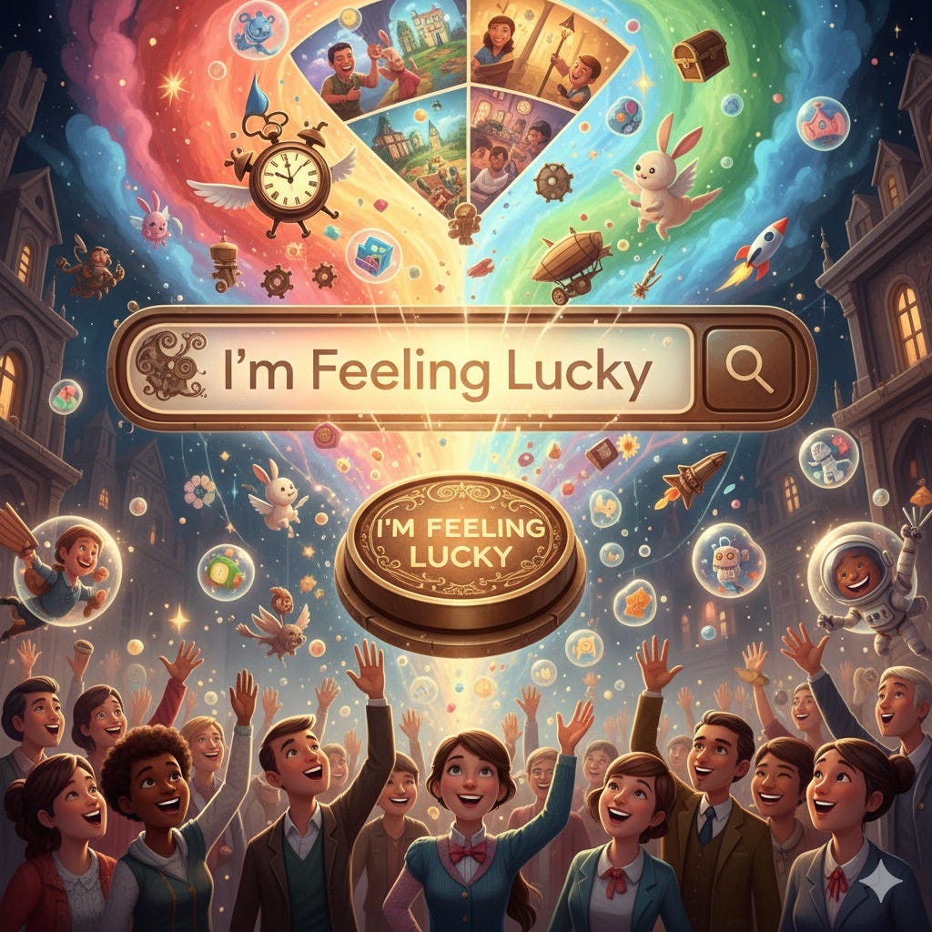
Case study 1: Google’s “I’m Feeling Lucky”, a million‑dollar monument to whimsy
For decades, a button on google.com has bypassed results-and search ads-to drop you straight into the top result. It’s charming. It’s “wasteful.” And Google kept it. Why?
As Sergey Brin once explained, the button aimed for “a pretty damn ambitious goal”-getting you to the exact right thing in one shot. Marissa Mayer added that fewer than 1% of searches used it, and ad‑tech leader Tom Chavez estimated “$110 million of revenue loss per year” from bypassed ads. Yet the company preserved it because it conveyed personality and confidence.
Mayer said it plainly: if you remove touches like that, “It’s possible to become too dry, too corporate, too much about making money.” In other words, the button signaled that real people were behind the product and users responded to that signal. (Business Insider)
Google’s Doodles play a similar role. They don’t accelerate a funnel. They humanize a giant, create shared moments, and get talked about thousands of times over since the first 1998 Burning Man doodle. (Google Doodles)
Lesson: Even at the most metrics‑driven company on earth, some features live to serve meaning. They trade a fraction of near‑term revenue for compounding brand equity.
Case study 2: Slack’s loading messages - smoothing the wait with wit
Slack popularized the notion that wait states are a brand canvas. Where many apps spin a sterile throbber, Slack shows playful one‑liners (“Need to whip up a dessert in a hurry?”… you know the vibe), quietly reminding you that people with a sense of humor made this tool. Observers have highlighted the practice for years; you can even customize your workspace’s loading messages to include tips, jokes, or culture-microcopy that makes the product feel more human. (Medium)
This wasn’t an accident. In his now‑famous “We Don’t Sell Saddles Here” memo, Slack CEO Stewart Butterfield wrote: “That’s why what we’re selling is organizational transformation.” He calls for “purposeful loading screens” and “every bit of grace [that] will pull people along.” Deliberate delight wasn’t decoration; it was part of the go‑to‑market. (Medium)
Slack’s early growth strategy doubled down on customer love not just ads. During its breakout, the team celebrated a Twitter “Wall of Love” and answered thousands of messages monthly to build goodwill that users then broadcast for free. That cadence of earned advocacy helped Slack explode without a CMO. (First Round)
Lesson: When delay is inevitable, delight the delay. And when a product is new, give people something worth talking about besides features-a voice, a wink, a moment.
“But should we really prioritize charm over speed?”
Of course not. Speed stays nonnegotiable. Jakob Nielsen’s classic thresholds still hold: ~0.1s feels instant; ~1s keeps flow; 10s tests patience. If you’re above those bands, fix performance first. When delays are unavoidable, show feedback and yes, a little personality to soften the wait. (Nielsen Norman Group)
Delight is a layer, not a license to ignore fundamentals.
How “useless” features create measurable business value
Even if the feature itself doesn’t move a core metric in isolation, it can trigger second‑order effects you can measure:
Peak/End shaping → Higher CSAT/NPS. Place delight at the peak of a journey (e.g., the moment a task completes) or at the end (e.g., graceful failure copy). People remember that and rate the whole experience higher. Track its effect on post‑task satisfaction or end‑of‑session NPS. (IUS UZH)
Distinctiveness → Recall and word‑of‑mouth. If your app’s only unforgettable moment is a timeout spinner, you’ve missed an opportunity. A tiny standout touch creates recall (von Restorff) and earns organic mentions, which Nielsen shows are the most trusted influences on buying. Monitor unprompted brand mentions and “I told a friend” survey responses. (Wikipedia)
Aesthetic‑usability effect → Tolerance for rough edges. No, you shouldn’t rely on it. But a more delightful interface reduces perceived friction and buys you some leeway during iterative improvement. Watch support contacts per 1,000 sessions and rage‑clicks before and after. (Laws of UX)
Brand moat → Pricing power and retention. Loyalty (and its proxy NPS) correlates with growth rates; NPS leaders tend to outpace peers. Delight helps you become the product people prefer, not just the one they tolerate. Track price sensitivity in win/loss notes and churn reasons shifting from “switching for features” to “we like them.” (Net Promoter System)
Where to place delight (and how to defend it)
1) Make a “moments” map, not just a funnel. Plot the journey’s emotional highs/lows: first‑run, first success, waits, errors, and “mission accomplished.” If you can only afford three delightful touches, pick one peak, one end, and one wait-the places memory over‑weights. (IUS UZH)
2) Write for humans. Treat microcopy as product, not filler. Slack’s own brand writers codified principles for a warm, clear voice-because words are the interface. Establish your copy principles and review microcopy like any other UI. (Slack Design)
3) Keep delight lightweight and accessible. Prefer fast, inclusive details (microcopy, tasteful motion, lightweight illustrations). Avoid heavy assets that slow first load or animations that induce motion sickness. When thinking about wait states, start with performance-then paint. (Nielsen Norman Group)
4) Instrument the right metrics. In addition to task success, track:
Unprompted compliments per 1,000 sessions (support, socials).
Share‑rate for moments likely to be captured or posted.
Session return within 7 days after a delightful “peak” (A/B).
Wall‑of‑Love counts (yes, borrow Slack’s playbook). (First Round)
5) Create a “Delight Backlog.” Ask every team to propose 1–2 micro‑ideas per quarter: empty‑state tone, completion confetti, celebratory emails, playful 404s, little Easter eggs. Time‑box them. Ship often.
6) Protect a small “delight budget.” Carve out, say, 1–2% of engineering/design capacity explicitly for “non‑critical” touches. The budget gives cover against the ROI‑or‑die reflex.
7) Document kill‑switches. Some users (or industries) prefer stoic UIs. Add toggles to tone down motion, humor, or color for compliance needs.
Objections you’ll hear-and how to answer them
“We can’t justify it.”
You probably can’t with last‑click metrics. But with loyalty and advocacy metrics you can. Bain shows NPS relates to growth; Nielsen shows recommendations dominate trust. Delight is one lever among many for both. (Net Promoter System)
“What if people think we’re not serious?”
Tone is contextual. Google’s homepage can feature doodles and a whimsical button and still be the world’s default place to search. Slack’s jokes didn’t prevent it from becoming a serious enterprise platform. The craft is in matching your brand’s maturity and audience. (Google Doodles)
“It’s lipstick on a pig.”
If performance or core tasks are broken, delight won’t save you. Ship fast first; add character second. Nielsen’s thresholds are a great rubric to hold yourself to. (Nielsen Norman Group)
A short gallery of “useless” masterstrokes
Google’s “I’m Feeling Lucky.” Rarely used. Provably expensive. Indelible brand signal that says, “We’re confident enough to skip the page that makes us money.”
Slack’s loading quips. Waiting is inevitable; waiting with a smile is a design choice. Admins can even make their own-turning a cost (boot time) into culture. (Atlassian)
Google Doodles. A recurring program of “delight for delight’s sake” that seeds conversation, nostalgia, and humanity into a giant. (Google Doodles)
Conclusion
It’s hard to A/B test the lifetime value of a smile. But the evidence suggests that if you consistently invest in honest, human details-especially at the peaks, ends, and waits-you’ll build an experience people remember fondly, talk about freely, and return to often.
So yes: keep your dashboards. Ship the reliable, the fast, the measurable. But reserve a sliver of your roadmap for moments with no immediate ROI-the playful copy that eases a wait, the celebratory flourish at “done,” the Easter egg that rewards curiosity. Those “useless” features are often the only parts people tell their friends about.
Don Norman once summarized it simply: “Attractive things work better.” When that attractiveness is honest and earned-not a veneer over broken flows-it becomes a growth strategy hiding in plain sight. (Don Norman’s JND.org)
Build for delight. The spreadsheets will catch up.