
The Liquid Glass Controversy: Apple’s Most Polarizing Design?

Apple’s design has long been the industry’s comfort food, simple, tasteful, and reliably legible - until Liquid Glass arrived and turned the chrome into a living, breathing material. Debuting across iOS, iPadOS, macOS, watchOS, and tvOS, this visionOS-inspired look refracts light, shifts with motion, and layers translucency like a cinematographer flexing in your menu bar. To some, it’s Apple finally making interfaces feel spatial and modern; to others, it’s a pretty filter that puts wallpaper where text should be. This post unpacks both reactions—why Liquid Glass dazzles, why it frustrates, and how a few guardrails (and a little user control) could decide whether it’s Apple’s boldest leap forward or its glossiest misstep.
1) The Unmistakable Apple Aesthetic
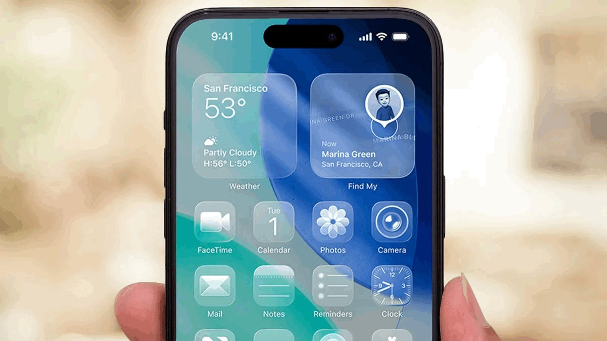
Apple has spent the better part of two decades cementing a reputation for design that’s both delightful and (usually) uncontroversial—think the original iPhone’s no-nonsense glass-and-metal monolith, or the serene clarity of macOS at its best. In 2025, Apple took a big, shimmering step forward (or sideways, depending on your eyesight) with Liquid Glass—a system-wide design language that turns interface chrome into translucent, depthy “material” that refracts light, responds to motion, and glides like kinetic sand.
Apple’s own description is unambiguous: Liquid Glass is a translucent material that “reflects and refracts its surroundings, while dynamically transforming to help bring greater focus to content.” (Apple) It’s not just a coat of blur; the WWDC session on the topic emphasizes how this new “digital meta‑material” bends light, adapts to content behind it, and even changes behaviors to preserve legibility (in theory). The keynote and developer session also introduce two variants—Regular (adaptive, designed for legibility) and Clear (permanently more transparent and intended for specific, media-heavy contexts). (Apple Developer)
Where does it show up? Everywhere. Apple says Liquid Glass now spans iOS 26, iPadOS 26, macOS Tahoe 26, watchOS 26, and tvOS 26, with details like a fully transparent macOS menu bar, reimagined sidebars, and layered app icons. (Apple) The look is heavily influenced by visionOS, where translucent panels are meant to feel spatial, contextual, and grounded in your environment. As MacRumors put it, “With its translucency, the visionOS interface can look almost like frosted glass.” (MacRumors)
While Liquid Glass is technically dazzling and often beautiful, it’s also Apple’s most divisive visual shift since iOS 7 retired skeuomorphism. Users either see the future—or strain to see anything at all.
2) The “Love It” Camp: A Glimpse into the Future
A sense of place and depth
Fans argue that Liquid Glass is the logical next step: not flat cards floating on flat backgrounds, but material that behaves like a physical object in a digital scene. Apple’s WWDC talk stresses how the glass adapts to what’s beneath, flips between light and dark styles to keep content readable, and uses scroll‑edge effects to separate moving content from navigation. If you squint (ironically), you can glimpse a UI that’s spatial and context‑aware rather than just decorative blur. (Apple Developer)
The elegance and wow factor
On the pure aesthetics axis, Liquid Glass can be irresistible. A Hacker News commenter captured the vibe neatly: “The UI is absolutely gorgeous and such a delight to use.” (Hacker News) MacRumors’ pre‑WWDC analysis painted the same picture - visionOS‑inspired glass that reads as frosted and premium, with dynamic lighting and shadows doing subtle, cinematic work in the background. (MacRumors) And Apple’s Newsroom hews to that line too, describing real‑time rendering, specular highlights, and elements that refract and reflect their surroundings. (Apple)
Fluidity and interactivity
Liquid Glass isn’t just a look; it’s a feel. Apple’s session calls out how controls flex, energize with light, and “materialize” rather than just fade in. The Regular variant is explicitly framed as legible “regardless of context,” and the system discourages “glass on glass” stacking to prevent clutter. When implemented by the book, interactions are buttery and satisfyingly physical. (Apple Developer)
If you enjoy a little spectacle with your spreadsheets, this is the first Apple UI in years that feels genuinely new.
3) The “Hate It” Camp: A Betrayal of Usability
The legibility nightmare
There’s no way around it: semi‑transparent UIs risk poor contrast. Even outside Apple‑land, the UX literature has warned for years that “glassmorphism” can undermine readability and add cognitive load if not carefully tuned. NN/g’s overview calls the style translucent and depth‑creating, but also stresses contrast and clarity basics to keep it usable. (Nielsen Norman Group) In controlled studies of type over complex backgrounds, combinations of Gaussian blur and semi‑transparent scrims performed best for legibility—practical guidance that aligns with Apple’s own advice to add dimming layers behind the “Clear” variant. (PubMed)
Real users have echoed this. One MacRumors forum regular, unimpressed by the shipping build, grumbled that “basic legibility has gone out the window.” (MacRumors Forums) Over on Reddit, the most upvoted PSA was delightfully blunt: “turn on Reduce Transparency under Settings > Accessibility > Display & Text Size.” (Reddit) Even Apple’s support docs now foreground the toggle - Reduce Transparency replaces translucent backgrounds with solid fills “to improve contrast and readability.” (Apple Support)
Distraction and cognitive overload
Our eyes are drawn to motion and detail. When you can glimpse a busy wallpaper—or worse, a video—through a toolbar, that background competes with foreground tasks. UX research in AR contexts has found that improper opacity settings over real‑world backgrounds can increase cognitive load and hurt task performance. Translation: transparent stuff over chaotic imagery makes your brain work harder. (ResearchGate)
Loss of simplicity
Apple’s best UIs put content first and friction last. Critics say Liquid Glass re‑introduces gloss and edge cases without guaranteed clarity. One pointed Hacker News quip: “Not a fan of transparent backgrounds… they are simply distracting.”(Hacker News) Another commenter took it further: “…I may switch to Linux for that reason alone.” (Ouch.) (Hacker News)
And yes, people are asking for middle ground rather than all‑or‑nothing accessibility switches. “I wish there was a middle ground,” wrote one Redditor—an opinion that pops up again and again in the iOS 26 beta threads. (Reddit)
4) Analysis: Why Is It So Divisive?
AR vs. traditional displays
Liquid Glass makes the most sense in visionOS, where Apple can treat your room as part of the UI, dimming and adapting elements to your surroundings. In that context, translucent materials bolster spatial context—you’re less likely to lose situational awareness if you can see through system chrome. Apple’s own guidance and WWDC talk stress that the material adapts, flips styles, and uses scroll‑edge effects to keep key UI readable. (Apple Developer)
On a laptop or phone, though, Apple can’t predict your background. Your wallpaper might be a tasteful gradient… or a neon festival poster from 2008. The same transparency that feels immersive in AR can feel noisy on a 2D canvas with arbitrary content underneath. That mismatch—born immersive, applied everywhere—explains a lot of the friction.
A historical parallel: skeuomorphism vs. flat
If you get déjà vu, you’re not imagining it. iOS 7’s flat reboot also triggered a wave of is this progress? anxiety. The Verge’s 2013 review memorably complained that clickable things were reduced to “only letters,” sometimes making the UI confusing. (The Verge) In other words, we’ve been here before: strong, opinionated visual metaphors pushed to their limits often spark backlash before they’re sanded down into something more usable.
The control factor
Underneath the aesthetics is a simple question: who’s in control? Apple does provide Reduce Transparency and Increase Contrast toggles—and, per the WWDC session, Liquid Glass responds to these. But many users don’t want to nuke the entire look; they want a graduated slider (say, 20–80% frost) or at least an “opaque mode” for key areas like the menu bar or tab bars. Apple’s docs admit the toggles are global hammers; the Reddit chorus keeps asking for a chisel. (Apple Support)
There are signs Apple has been listening. During the betas, tech press noted Apple increased frosting in some areas to improve readability after early criticism of overly transparent elements. (In other words: less “liquid,” more “glass.”) (The Verge) That’s good—but a system‑level opacity control would reduce the temperature of this debate overnight.
5) Conclusion: A Bold Step or a Beautiful Mistake?
Liquid Glass embodies a genuine tension in modern interface design:
On one side, a futuristic, expressive material that unifies platforms, introduces delightful motion, and suggests a more spatial future for computing. Apple’s description—“translucent… reflects and refracts its surroundings… dynamically transforming”—isn’t hype; the tech behind it is real and often stunning. (Apple)
On the other, the fundamentals: task clarity, focus, and legibility in messy, real‑world conditions. The UX research is clear that translucency requires careful balance (blur + scrim, adequate contrast, limited motion), or it adds cognitive load and hurt readability. (PubMed)
So is Liquid Glass a bold step forward that needs a few nips and tucks, or a beautiful mistake that drifts from Apple’s clarity‑first ethos? For now, the fairest answer is “both.” It’s ambitious and technically impressive, but it also shows how design language can escape the habitat it evolved for (spatial environments) and stumble in noisier ones (our desktops and phones).
If Apple pairs Liquid Glass with more user‑level control—a simple opacity slider, a per‑area “opaque mode,” and tougher contrast guardrails—the controversy will likely simmer down into the background (unlike your wallpaper, which will continue to shout through your toolbar).
What do you think? Is Liquid Glass a design triumph or a usability failure? And if you need a quick legibility fix today, try Apple’s own advice: Settings → Accessibility → Display & Text Size → Reduce Transparency. (Apple Support)