
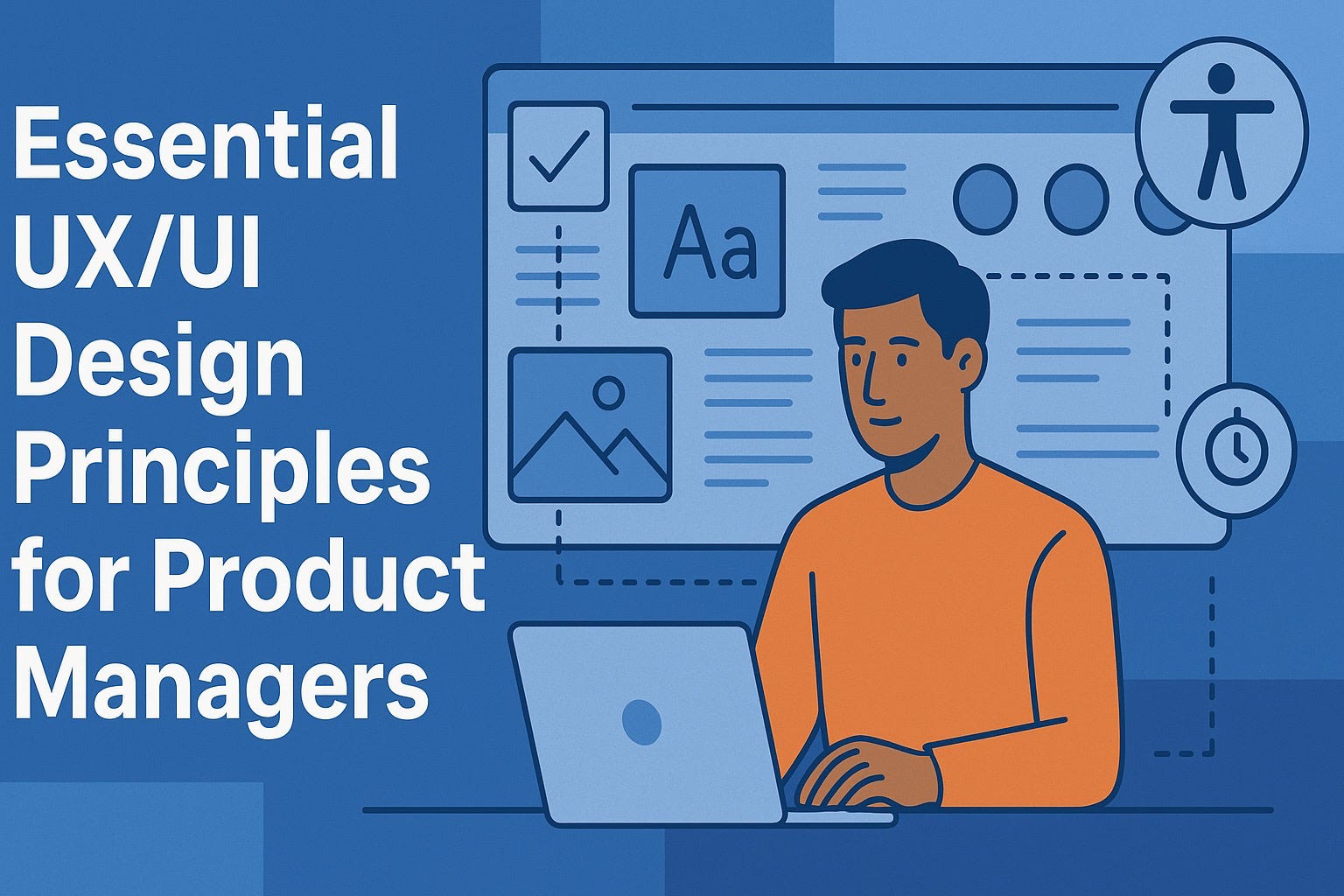
What are The Essential UX/UI Design Principles Every Product Manager Needs to Know?

Great product managers don’t need to push pixels, but they do need a firm grasp of the UX/UI principles that make products usable, accessible, and measurably effective. That’s not just craftsmanship—it’s business performance. McKinsey’s multi‑year study of 300 public companies found that firms in the top quartile of its Design Index delivered 32 percentage points higher revenue growth and 56 percentage points higher total returns to shareholders over five years. (McKinsey & Company)
1) Start with a precise definition of “usable”
ISO 9241‑11 defines usability as “the extent to which a product can be used by specified users to achieve specified goals with effectiveness, efficiency, and satisfaction in a specified context of use.” This wording is precise for a reason: it forces teams to identify the right users, real goals, and the actual context—all of which your roadmap should explicitly capture. (NIST Computer Security Resource Center)
PM takeaways
Write “context of use” into PRDs (personas, environments, constraints).
Review designs against the three outcomes: effectiveness (can they complete tasks?), efficiency (how fast/effortful?), satisfaction (did it feel good?).
2) Apply the usability heuristics that catch 80% of issues early
Nielsen Norman Group’s 10 Usability Heuristics have endured because they’re pragmatic: visibility of system status, match to the real world, user control, consistency/standards, error prevention, recognition over recall, flexibility/efficiency, minimalist design, helpful error recovery, and help/documentation. Use them as a pre‑flight checklist in design reviews and bug triage. (Nielsen Norman Group)
Two you’ll use daily:
Consistency & standards. “Users spend most of their time on other sites.” That’s Jakob’s Law—so follow conventions unless there’s clear value in deviation. (Nielsen Norman Group)
Error prevention. It’s cheaper (and kinder) to prevent mistakes than to explain them. Build constraints, sane defaults, confirmations for destructive actions, and forgiving inputs. (Nielsen Norman Group)
3) Reduce cognitive load: design for how people actually decide and remember
Hick‑Hyman Law. Decision time increases logarithmically as choices grow. Use progressive disclosure, grouping, and smart defaults to reduce choice overload (don’t just delete options). (Wikipedia)
Recognition over recall. Prefer visible options over requiring memory. (It’s one of the 10 heuristics for a reason.) (Nielsen Norman Group)
Working memory limits. The folk rule “7±2” is often misapplied; modern evidence suggests practical limits closer to ~4 chunks. Don’t design flows that make people remember codes, steps, or rules across screens. (PMC)
Gestalt grouping. “Items close together are likely to be perceived as part of the same group.” Use proximity and similarity to signal relationships and reduce scan time. (Nielsen Norman Group)
PM takeaways
Push for progressive disclosure: only ask for what’s needed now.
Demand visual grouping in specs (spacing, headings, containers) to map UI layout to task structure.
4) Accessibility is non‑negotiable—and measurable
WCAG 2.2 became a W3C web standard on October 5, 2023; it adds criteria that help users with cognitive and mobile constraints, among others. Make Level AA your baseline acceptance criteria. (W3C)
Reality check: WebAIM’s 2025 scan of one million home pages detected ~51 accessibility errors per page on average—and 94.8% of pages still had WCAG failures. That’s both risk and opportunity. (WebAIM)
PM takeaways
Add WCAG 2.2 AA to your Definition of Done and release checklist. (W3C)
Track automated error counts over time (WebAIM/WAVE or axe) as a quality KPI; manual audits still required for full coverage. (WebAIM)
5) Make it physically easy: target sizes & motor effort
Fitts’s Law predicts faster, less‑error‑prone pointing when targets are larger and closer. NN/g summarizes it plainly: “People will be faster to click, tap, or hover on bigger targets.” (Nielsen Norman Group)
Platform heuristics embody this:
Apple: “As a general rule, a button needs a hit region of at least 44×44 pt.” (Apple Developer)
Android / Material: “Consider making touch targets at least 48×48 dp (~9 mm).” (Material Design)
PM takeaways
Put minimum target sizes and spacing into your component specs and design system tokens. (Apple Developer)
6) Speed is a UX feature (and a revenue feature)
Deloitte’s independent analysis for Google found that improving mobile site speed by just 0.1 seconds lifted retail conversions by 8% and travel by 10%—over four weeks across 37 brands. Milliseconds make millions. (Google Business)
PM takeaways
Include Core Web Vitals or app startup metrics as first‑class OKRs.
Scope performance budgets into epics and enforce them in CI.
7) Treat content as part of the interface
Clear microcopy reduces errors, support tickets, and task time. The GOV.UK style guide says it best: “Use plain English to make the purpose of the content clearer, and write like you’re talking to your user one‑on‑one.” Microsoft’s guidelines echo this: lead with the benefit, be concise, and write directly to “you.” (GOV.UK)
PM takeaways
Add content reviews to design critique.
Prefer verbs and plain language in buttons, labels, and error text; reserve brand “voice” for marketing, not instructions. (GOV.UK)
8) Instrument what matters: HEART, GSM, and a few honest benchmarks
Google’s HEART framework gives PMs a scalable way to connect UX to metrics: Happiness, Engagement, Adoption, Retention, Task success—paired with a Goals‑Signals‑Metrics (GSM) mapping. In the authors’ words, “we describe the HEART framework for user‑centered metrics, as well as a process for mapping product goals to metrics.” Use HEART across journeys and releases to avoid vanity metrics. (Google Research)
Two practical yardsticks:
Task success (time‑on‑task, completion rate) for key flows.
System Usability Scale (SUS) after major changes; 68 is average, ~80+ is strong. (JUX - The Journal of User Experience)
PM takeaways
For each epic, define a HEART slice with 1–2 metrics that ladder to your North Star.
Use SUS in betas or post‑release to benchmark perceived usability over time. (JUX - The Journal of User Experience)
9) Build for consistency at scale: adopt a design system
Design systems translate UX principles into reusable components, tokens, and conventions—which means faster delivery, fewer regressions, and a more coherent product family. Atlassian puts it plainly: centralized, reusable components align designers and developers and make it simpler to scale. As a PM, bake system adoption into your definition of done. (Atlassian Design System)
PM takeaways
Prioritize componentization in early redesigns; measure % surfaces using system components and time‑to‑release deltas. (Atlassian Design System)
10) Test early, small, and often—and experiment for real
Discount usability testing remains one of the best ROI moves in product. NN/g’s long‑standing guidance: “Test 5 users in a qualitative usability study. Testing with 5 people lets you find almost as many usability problems as you'd find using many more test participants.” Use it to fuel iterative fixes—then test again. (For quantitative estimates or segmentation, you’ll need larger samples.) (Nielsen Norman Group)
When the design is in the wild, switch to controlled experiments. As HBR put it, “Controlled experiments can transform decision making into a scientific, evidence‑driven process—rather than an intuitive reaction.” Start with guardrails and a few trustworthy KPIs, and don’t be surprised when humbling results overturn “obvious” ideas. (Harvard Business Review)
PM takeaways
Budget for continuous small‑n usability tests each sprint (prototype or staging). (Nielsen Norman Group)
Maintain an experimentation backlog; insist on pre‑registration of hypotheses and metrics to avoid p‑hacking. (exp-platform.com)
11) Don’t forget the human memory of the journey
People judge experiences by their peaks and endings (the peak‑end rule). Close support interactions, onboarding, and error recoveries on a high note—what users remember drives return and referral. (Wikipedia)
Closing thought
The best product managers translate UX/UI principles into clear decisions, crisp specs, and measurable outcomes. If you do nothing else, do these three:
Codify ISO’s usability definition in your PRDs. (NIST Computer Security Resource Center)
Instrument HEART metrics for every critical journey. (Google Research)
Run continuous small tests (pre‑launch) and controlled experiments (post‑launch). (Nielsen Norman Group)
The payoff isn’t theoretical. As McKinsey’s data shows, design excellence is correlated with outsized revenue and shareholder returns. Your job is to make that excellence repeatable. (McKinsey & Company)