
Why We Killed Our Most Beloved Feature (And What Happened Next)

“Focusing is about saying no.” - Steve Jobs, WWDC ‘97.
Every product has that one feature: the demo darling, the thing power users rave about on X/Twitter, the crowd‑pleaser sales mentions right before pricing. For us, that feature was Timeline-a beautiful, Gantt‑style view that let teams drag, stretch, and color‑code their plans with precision.
And we killed it.
This is the story of how we made that decision, the data that forced our hand, the psychology that helped us see past our biases, and what happened after we pressed delete.
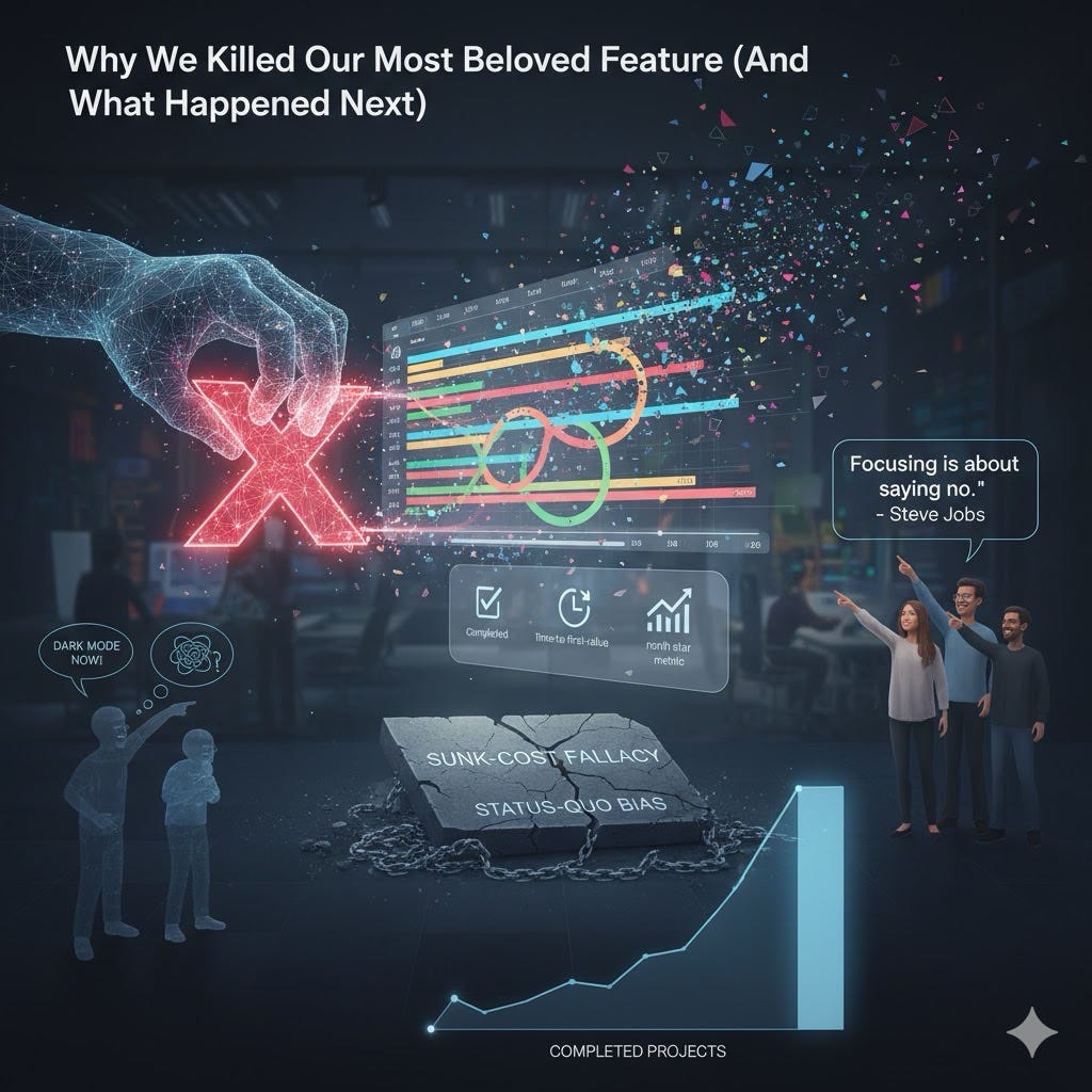
The feature we loved (but that didn’t love most users back)
The timeline was a triumph of craft. It won us deals with a handful of sophisticated accounts. It also became a gravitational center for requests: more zoom levels, baseline comparisons, public links, custom calendars, critical path, holidays, dependencies, lag/lead, CSV import, API mutations, and yes-dark mode.
If you looked only at qualitative feedback, you’d think we had found product‑market fit in its purest form. But qualitative love can be deceptive when it’s narrow. So we dug into the numbers.
Adoption: In a typical 30‑day window, just 11% of monthly active users visited Timeline at all; only 2.8% interacted with it on 5+ days that month.
Onboarding drag: In a 50/50 navigation test for new sign‑ups (Timeline visible vs. hidden), activation within 7 days was 6.1 percentage points higher when Timeline wasn’t visible.
Support load: Timeline accounted for 42% of how‑to tickets and 31% of bug reports while representing <5% of total events fired.
Performance/maintenance: It added ~240 KB to our largest JavaScript chunk, introduced an outsized share of flaky E2E tests, and required a quarterly deep‑maintenance cycle around daylight saving and timezone edge cases.
Internally, a histogram of “days active” for Timeline users-the power‑user curve-told the story in one frame: a small spike at the far right (true believers) and a long, low tail of people who bounced after a single try. (If you’ve never used power‑user curves to sanity‑check engagement, Andrew Chen’s overview is a good primer. (andrewchen.com))
None of this would have mattered if Timeline pushed our North Star-the single metric representing customer value for our product strategy. It didn’t. Our North Star (for us: Completed Projects per Active Account) rose when teams created, iterated, and finished projects, not when they fine‑tuned dates. Timeline was nice‑to‑have craft, not must‑have progress. (On the North Star concept and inputs, see Amplitude’s playbook. (Amplitude))
Why “more” wasn’t better (and the research that predicted it)
We weren’t the first team to learn that adding capability can hurt usability. Classic research on feature fatigue shows people overweight capability before use but prefer usability after use-a gap that leads them to choose overly complex products and regret it later. (SAGE Journals)
Related psychology warns about choice overload: in the famous jam study, shoppers presented 24 flavors sampled more but purchased less, while those offered 6 options were ten times more likely to buy (3% vs. 30%). The pattern has been replicated across contexts-more options feel good upfront and backfire at decision time. (UW Faculty)
Nielsen Norman Group’s guidance on progressive disclosure is blunt: defer advanced or rare features to secondary surfaces to reduce errors and cognitive load. We had done the opposite-promoting an advanced planning tool to top‑level navigation. (Nielsen Norman Group)
Even consumer hardware bears this out: a New Yorker piece once highlighted a Philips study showing that half of returned products weren’t broken-users simply couldn’t figure them out. Complexity sells on shelves; it disappoints in hands. (The New Yorker)
Finally, there’s the quiet tax of keeping “just one more thing.” McKinsey estimates that CIOs divert 10–20% of the tech budget for new products to servicing technical debt, and that tech debt can amount to 20–40% of the value of the entire technology estate. Features like Timeline aren’t only UI- they are debt with a compounding interest rate. (McKinsey & Company)
The decision: noticing our own biases
We didn’t lack evidence; we lacked permission to act on it. Two biases were at play:
Sunk‑cost fallacy: the tendency to keep investing because we’ve already invested. Arkes and Blumer formalized this in 1985; past costs irrationally constrain present decisions. (ScienceDirect)
Status‑quo bias: the irrational preference for keeping things as they are (Samuelson & Zeckhauser, 1988). In product, this bias can masquerade as “not breaking contracts with customers.” (SpringerLink)
Naming these biases aloud in our decision memo helped us separate evidence from attachment. It also gave the exec team a shared language: “Are we protecting users, or are we protecting our past selves?”
How we sunset it (our six‑step playbook)
Killing a feature shouldn’t feel like pulling the fire alarm. We followed a playbook inspired by Intercom’s advice on sunsetting and adapted it to our stack. (Intercom)
Freeze scope & add a kill switch. We put Timeline behind a feature flag and halted net‑new work. Only P0 bugs got attention.
Stop the bleeding. We removed Timeline from marketing pages, pricing grids, and sales talk tracks. New sign‑ups never saw it by default.
Quantify impact & identify cohorts. We built cohorts of heavy, casual, and accidental Timeline users, plus account‑level revenue exposure.
Design migrations, not apologies. We shipped Saved Views with date groupings, Milestones, and Slack digests-the 80/20 of customers’ actual jobs‑to‑be‑done without the date‑micromanagement. We also built a one‑click export (CSV + image).
Communicate like adults. A 60‑day notice, in‑product banners, email, and CSM‑led calls for top accounts. We gave heavy users a 6‑month grace period and offered credits if they needed time to re‑work workflows.
Measure, then remove. At T+60 we default‑hid Timeline for everyone but the grace group. At T+180 we removed it from the codebase, archived docs, and deleted the data model.
Throughout, we maintained a single public FAQ with dates, alternatives, and a clear “why.” That last part mattered more than any discount.
What happened next (the part people ask me about)
Short version: we took a short‑term hit from a small cohort and a medium‑term leap for everyone else.
The hit (expected):
We saw a 3.2‑point increase in gross churn among a tiny segment (the heaviest Timeline users) over the first 90 days.
Social posts and a few sharp emails. (When you say “no,” you hear about it first from the most invested-Jobs warned us. (Sebastiaan van der Lans))
The lift (also expected, but still satisfying):
Activation (completed first project within 7 days) rose +7.4 pp across new cohorts once Timeline disappeared from first‑run nav.
Time‑to‑first‑value dropped 28%.
Support tickets per 1,000 WAU fell 19% within 60 days.
North Star (Completed Projects per Active Account) increased +5.6% by day 90.
Bundle size shrank by ~240 KB, cutting median first contentful paint by ~210 ms on mid‑tier devices.
The second‑order effects (the real payoff):
The two engineers who lived in Timeline code spent a quarter shipping Auto‑Assign and Dependency Alerts, which collectively improved on‑time delivery by 9% for teams that opted in.
PMs stopped accommodating edge cases and started refining core flows. Design reclaimed precious space in the navbar and tuned our information architecture for novices first.
Was it perfect? No. A few accounts had to redo reporting. One integration partner needed a new endpoint. Our docs could have anticipated more “how do I recreate X” recipes. But the net impact matched the strategy-and that’s the bar.
“Perfection is achieved not when there is nothing more to add, but when there is nothing left to take away.” - Antoine de Saint‑Exupéry. (Oxford Reference)
What I learned (and the rubric we use now)
Here’s the kill‑or‑keep rubric we now apply every quarter. It’s intentionally simple:
North‑Star fit: Does this feature directly push our North Star (or its input metrics)? If not, it starts in the red. (For context on North Star frameworks, see Amplitude.) (Amplitude)
Adoption & concentration: Is usage broad or ultra‑concentrated? A healthy power‑user curve should show a meaningful middle, not just a spike at 1 day and another at 30. (andrewchen.com)
Onboarding impact: Does the feature help or hurt first‑run focus? If it creates choice overload for novices, hide it via progressive disclosure-or cut it. (Nielsen Norman Group)
Support & reliability: % of tickets, % of incidents, and the ratio of “how‑to” to “bug” issues. Features that generate confusion-even without failures-impose real costs. (See the Philips return anecdote for why perceived complexity matters.) (The New Yorker)
Debt & drag: Estimated servicing cost (people and time), bundle weight, test flake, and ecosystem constraints. If you’re spending double‑digit percentages of your budget nursing a non‑core feature, you are paying compounding interest. (McKinsey & Company)
Viable migration: Can we cover the 80/20 with simpler primitives? Killing without a path breeds resentment; migrations create trust. (Intercom’s sunsetting advice remains pragmatic.) (Intercom)
Two final, practical notes:
Don’t bury a decision in euphemism. “Deprecate,” “retire,” “evolve”-use whatever words you like, but be clear about the end date and the why. People respect candor even when they disagree.
Reward the behaviors you want internally. We ran a post‑mortem for Timeline that celebrated engineering excellence and celebrated the courage to remove. We gave a small internal award-“Best Deletion”-to normalize pruning.
The uncomfortable truth: addition by subtraction
Killing Timeline wasn’t an anti‑customer move. It was an act of respect for the majority of customers’ time and attention-and for our team’s focus. In the moment, it felt like we were taking something away. In hindsight, we were giving users back a simpler path to value and giving our team back the energy to build the right next thing.
If you’re wrestling with your own “beloved feature,” consider this mix of data and discipline:
Look past the loudest voices; measure breadth, depth, and frequency, not just sentiment.
Put experiments in front of principles. If hiding the feature meaningfully improves activation or time‑to‑value, you have your answer.
Name your biases. You’re not just fighting a code path-you’re fighting sunk cost and the status quo. (ScienceDirect)
Communicate early, offer migrations, and keep receipts (dates, docs, exports).
One day, that deletion may be the most customer‑loving “feature” you ship.
And if you need a mantra when the emails roll in? Borrow Jobs’s line and repeat it to your team: Focusing is about saying no.